Introduction: Preparing to Add React Vertical Tabs
This article focuses on how to add vertical tabs to React Admin Forms and is a continuation of the tutorial series on how to extend React Admin. If you need to catch up on React Admin, you can read the introductory article or explore React Admin’s documentation page.
This tutorial will explain how to declutter a form using vertical tabs from the Material-UI library. To clarify, React Admin already has tabbed forms. However, it’s difficult to set the tabs to a vertical orientation like Material-UI’s <Tabs> component.
To implement the vertical tabs, the tutorial will take you through:
Downloading a starter repository on Github
Recreating the <TabbedForm> component in React Admin
Defining custom tabs
Adding auxiliary components to sync the interface between React Admin and Material UI
The component tries to stay within the workflow of React Admin to make the implementation simple and manageable.
Prerequisites
There are a couple of prerequisites that this tutorial requires:
Understanding of how ReactJS works
Basic networking jargon (i.e., request, API call, fetch)
How to open and use the command line on your OS
Code editor (i.e., VSCode, Sublime Text, Atom, Vim)
If you get stuck along the way, feel free to check out the complete project on Github.
I am using VSCode on a macOS system. If you need help along the way, check out the complete repository on Github for guidance.
Download Starting Repository
To download the starter template, open up a new terminal (command-line) and navigate to where you want to place the repository.
Then, execute the following command to clone the repo.
git clone https://github.com/jdretz/starter-project-ra-vertical-tabs.git react-admin-vertical-tabs
Change directories into the new repository and install the dependencies.
cd react-admin-vertical-tabs yarn install
Finally, after downloading all the packages, run yarn start to run the application. A new browser should open up to http://localhost:3000, and you’ll see the app’s dashboard.
Project Overview
This project includes the drag-n-drop row components from a previous article. Furthermore, it uses the same fake data provider and a “users” resource.
The app retrieves the data from your browser’s local storage with the help of a mock service worker. The service worker has a series of handlers (at src/mocks/handlers.js) that intercepts requests from the custom data provider (in src/dataProvider.js).
Therefore, if you ever need to reset the data during this tutorial, you can go into your browser’s developer tools, navigate to local storage, and delete the “forms” or “users” items.
Using a mock service worker as a data provider is not something that you should do in production. However, it’s convenient for the tutorial.
We’ll spend our time customizing the “users” resource in the src/users.js.
Implement React Admin Tabs
First, let’s implement the standard default tabs that React Admin provides. This will add context to the component implementation.
Open src/users.js. Import two new components at the top from React Admin:
TabbedForm
FormTab
Then, split up the <UsersCreate> form in the file to match the code below:
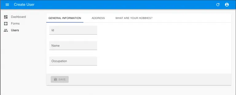
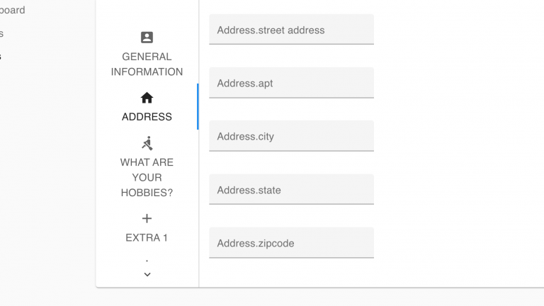
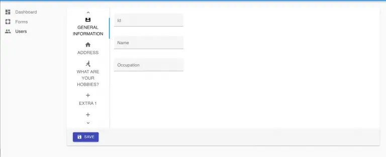
export const UsersCreate = props => ( <Create {...props}> <TabbedForm> <FormTab label="General Information"> <TextInputsource="id"/> <TextInputsource="name"/> <TextInputsource="occupation"/> </FormTab> <FormTab label="Address"> <TextInput source="address.streetAddress"/> <TextInput source="address.apt"/> <TextInput source="address.city"/> <TextInput source="address.state"/> <TextInput source="address.zipcode"/> </FormTab> <FormTab label="What Are Your Hobbies?"> <ArrayInputsource="hobbies"> <HobbiesCustomIterator/> </ArrayInput> </FormTab> </TabbedForm> </Create> );
Now, when creating a new user, your form has three tabs.
React Admin uses Material UI’s Tab component and handles the tab display through a <Route> component by default. Our component will implement many of the same properties as <TabbedForm>.
However, we’ll manually pass the tabs in, move the toolbar component, and take out much of the route handling infrastructure that the <TabbedForm> includes.
Create Custom Vertical Tab Component
In the src folder. Create a new file named VerticalTabbedForm.js.
Inside of the new file paste in the following code:
import React, { Children, useState, cloneElement, isValidElement } from 'react'; import { FormWithRedirect } from 'react-admin'; const CustomForm = (props) => { const { basePath, children, className, classes: classesOverride, handleSubmit, handleSubmitWithRedirect, invalid, mutationMode, pristine, record, redirect: defaultRedirect, resource, saving, submitOnEnter, tabs, toolbar, undoable, variant, margin, validating, ...rest } = props; const [tabValue, setTabValue] = useState(0); const handleChange = (event, value) => { setTabValue(value); }; return ( <div> <form // not sanitizing {...rest} > {cloneElement( tabs, { onChange: handleChange, value: tabValue, }, children )} <div style={{ flexGrow: '1', padding: '16px' }}> {Children.map(children, (tab, index) => { if (!tab) { return; } return ( <div> {isValidElement(tab) ? cloneElement(tab, { intent: 'content', resource, record, basePath, hidden: tabValue !== index, variant: tab.props.variant || variant, margin: tab.props.margin || margin, value: index, }) : null } </div> ); })} </div> </form> {toolbar && cloneElement(toolbar, { basePath, className: 'toolbar', handleSubmitWithRedirect, handleSubmit, invalid, mutationMode, pristine, record, redirect: defaultRedirect, resource, saving, submitOnEnter, validating, undoable, })} </div> ); }; export const VerticalTabbedForm = (props) => ( <FormWithRedirect {...props} render={formProps => <CustomForm {...formProps} />} /> )
This code is extremely similar to the source code for the <TabbedForm> component. Additionally, it’s often the case that we use some derivation of React Admin’s <FormWithRedirect> component when customizing the application.
Next, let’s import the new component into users.js and replace <TabbedForm>.
export const UsersCreate = props => ( <Create {...props}> <VerticalTabbedForm> <FormTab label="General Information"> <TextInput source="id"/> <TextInput source="name"/> <TextInput source="occupation"/> </FormTab> <FormTab label="Address"> <TextInput source="address.streetAddress"/> <TextInput source="address.apt"/> <TextInput source="address.city"/> <TextInput source="address.state"/> <TextInput source="address.zipcode"/> </FormTab> <FormTab label="What Are Your Hobbies?"> <ArrayInput source="hobbies"> <HobbiesCustomIterator/> </ArrayInput> </FormTab> </VerticalTabbedForm> </Create> );
After saving and trying to create a new user, you’ll see an error.
Error: React.cloneElement(...): The argument must be a React element, but you passed undefined.
<TabbedForm> uses default tabs based on the panels. Conversely, our component requires a tabs component passed as the tabs prop.
Define Custom Tabs
In users.js, let’s create a custom tabs component using Material UI’s <Tabs>.
At the top of the file, add the following imports and components.
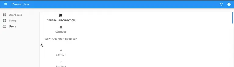
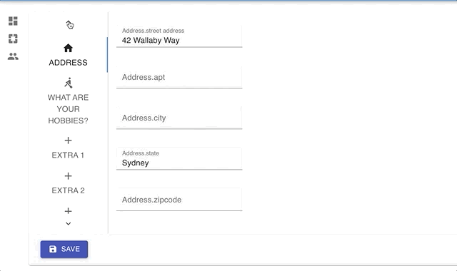
... import Tabs from '@material-ui/core/Tabs'; import Tab from '@material-ui/core/Tab'; import AccountBoxIcon from '@material-ui/icons/AccountBox'; import HomeIcon from '@material-ui/icons/Home'; import RowingIcon from '@material-ui/icons/Rowing'; import AddIcon from '@material-ui/icons/Add'; import withStyles from '@material-ui/styles/withStyles'; import Typography from '@material-ui/core/Typography'; const MuiTabs = withStyles({ root: { borderRight: '1px solid #CCC' } })(Tabs); const CustomTabs = (props) => { return ( <MuiTabs orientation="vertical" variant="scrollable" value={props.value} aria-label="Vertical tabs example" onChange={props.onChange} > <Tab label="General Information" icon={<AccountBoxIcon />} /> <Tab label="Address” icon={<HomeIcon />} /> <Tab label="What Are Your Hobbies?" icon={<RowingIcon />} /> <Tab label="Extra 1" icon={<AddIcon />} /> <Tab label="Extra 2" icon={<AddIcon />} /> <Tab label="Extra 3" icon={<AddIcon />} /> <Tab label="Extra 4" icon={<AddIcon />} /> <Tab label="Extra 5" icon={<AddIcon />} /> </MuiTabs> ) } ...
Then, pass the new tabs into <VerticalTabbedForm> along with the props.
... export const UsersCreate = props => ( <Create {...props}> <VerticalTabbedForm tabs={<CustomTabs {...props} />}> <FormTab label="General Information">
The error disappears, but the tabs and panel aren’t right.
Correct Styling
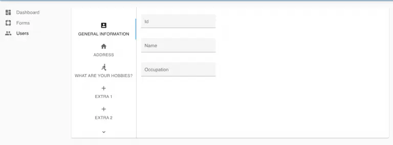
We can solve the majority of the styling issues by adding some CSS to the <form> element in <VerticalTabbedForm>.
You can add these properties how you wish. Because this is a tutorial, I chose to add an inline style object.
... return ( <div> <form style={{ display:'flex', height:'450px', overflow:'auto' }} // not sanitizing {...rest} > ...
Save the file and observe how this corrects the layout of our tabs!
In truth, getting to this layout can be done without creating <VerticalTabbedForm>. You could pass the custom tabs into <TabbedForm> with an inline style object making the display ‘flex’. However, positioning the toolbar becomes a problem. Consequently, I decided to roll the <VerticalTabbedForm>, giving us more control over the layout.
In the next section, we’ll add a toolbar and constraints to the tab label.
Add <Toolbar> and <TabLabel>
First, let’s wrap our tab labels in a component that restricts width. Create the <TabLabel> component (remembering to import Typography).
const TabLabel = ({ text }) => ( <Typography style={{ width: '125px' }}>{text}</Typography> )
Then, wrap the label string for each tab with <TabLabel>.
<Tab label={<TabLabel text="General Information" />} icon={<AccountBoxIcon />} />
Second, we can pass in a toolbar exposing the <SaveButton> for the entity.Still in users.js, add the code:
... const UsersCreateToolbar = (props) => { return ( <Toolbar style={{ marginTop: 0 }} {...props}> <SaveButton /> </Toolbar> ) } ...
Finally, pass the toolbar component into <VerticalTabbedForm>.
... export const UsersCreate = props => ( <Create {...props}> <VerticalTabbedForm tabs={<CustomTabs {...props} />} toolbar={<UsersCreateToolbar {...props} />} > <FormTab label="General Information"> ...
After saving the file, the vertical tabs in React are complete and functional!
The Extra tabs were added so you could see the scrolling features that Material-UI provides out-of-the-box. You could easily remove them from <CustomTabs> to only display tabs in use.
This tabbed form has navigable sections, and you can save new information no matter the tab that is in view!
Conclusion
The component works but sidesteps some of the characteristics that make React Admin components reliable. For example, some of the props are unsanitized, and the component does not use Typescript.
Furthermore, it needs work to become a truly responsive view. That’s why it’s important to understand if React is the optimal choice. Fortunately, we have a lot of freedom with the new components to create the right experience for the user.