Why You Should Choose Drupal 9 For Your Structured Data-Driven Website

A Bit of Background on Drupal
In October of 2019, Dries Buytaert, Drupal founder and open source evangelist, presented his annual State of Drupal keynote speech at Drupalcon in Amsterdam. Although he announced some interesting developments for Drupal 8, including a long-awaited Media Library and off-the-shelf support for Composer, Drupal 9 was truly the star of the show. Buytaert described the four-track product strategy for Drupal 9, which aims to create the web’s premier open-source content management system. The four tracks Buytaert outlined are, namely:
Reduce cost and effort
Prioritize the beginner experience
Drive the open web
Be the best structured data engine
The four tracks were presented as equal priorities, though improving the beginner experience was probably the most interesting one, since it speaks to perhaps Drupal’s biggest historical weakness. Collectively, they represent an ambitious vision for an exciting platform.
Overview of the Drupal 9 Product Strategy
To achieve the first goal, the Drupal team is focused on automating updates and simplifying configuration management. Meanwhile, the most visible initiative for improving the beginner user experience is the development of a new default frontend theme called Olivero and a new admin theme called Claro; these elegant, contemporary themes should give users a better initial impression of Drupal and reflect the modern technology that runs Drupal behind the scenes. That robust, standards-based technology is what makes Drupal ideal for applications that must handle large amounts of structured data. As Buytaert explains, the Drupal community of developers should build on this strength by continuing to improve its ability to manage more data, handle more diverse data, and, through its flexible API, facilitate more integrations across more devices and channels–to make Drupal more than a content management system but indeed a data engine. All of these factors combined, along with an emphasis on security, accessibility, and privacy, will help Drupal achieve the operational and philosophical goal of driving the open web.
A Deeper Dive Into the Beginner Experience
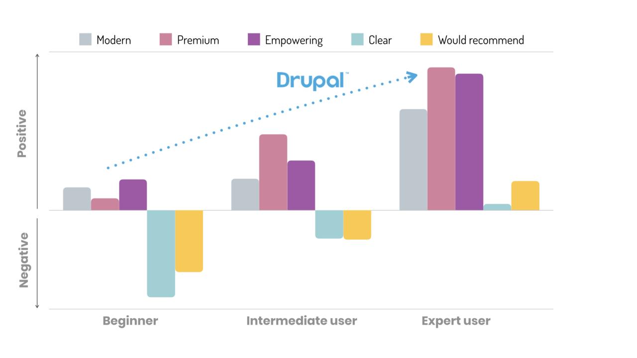
It’s conventional wisdom among Drupal developers that the user experience for beginners has historically been less than ideal, and that positive sentiment among users tends to go up with experience, as they discover Drupal’s potential–its consistency, flexibility, and scalability. This anecdotal theory is born out by one of the graphs Buytaert showed in his presentation:

As you can see, the most negative sentiment for the beginner relates to Drupal’s relative opaqueness compared to other platforms; that is, it’s not as easy to pick up compared to, say, WordPress. The author can attest from firsthand experience that Drupal isn’t the most welcoming platform, full of “Drupalisms” (Nodes? Entities? Vocabularies?) and, more generally, requiring good planning and comprehensive content structuring in a way not demanded by more “retail” user-oriented platforms like WordPress. Endertech began focusing on Drupal in earnest when Drupal 8 was in beta, toward the tail end of Drupal 7’s life cycle, so we have firsthand experience with Drupal’s notoriously inconsistent documentation (programmers prefer writing code than writing about code–go figure!), and we had to contend with a lot of unfinished module ports to the new version, often having to patch modules ourselves to get them to work in D8. Admittedly, this is due more to our timing rather than intrinsic issues, but still, five years into using Drupal and I can confirm that the trajectory of my experience–and my feelings about it–reflects that of users in general.
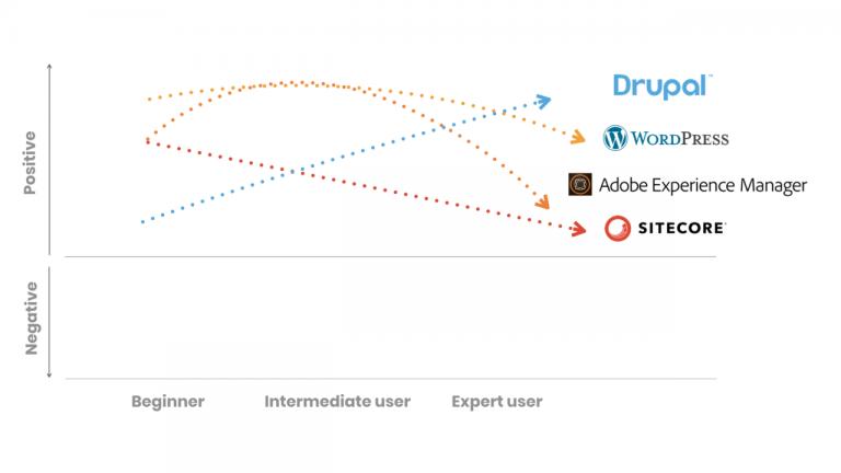
Even more striking than the graph above is one that compares Drupal to other major CMS platforms:

It’s no surprise that of the four platforms, WordPress earned the highest grade from beginners. WordPress has always been geared more toward non-technical site administrators, and its admin interface is more accessible, at least historically, than Drupal’s, so it’s easier for a newcomer to hit the ground running with WordPress. The most remarkable detail from this graph, though, is that among the four competing platforms, only for Drupal did user sentiment improve over time. Some saw sentiment improve for intermediate users, before nosediving for expert users. Why could that be? Of the three Drupal competitors, I have experience only with WordPress and, looking into the details for that platform in Buytaert’s presentation, we learn that its users actually rate it as increasingly less “clear” and “empowering” over time. Once again, these findings are reflected in my own experience as a developer–it’s incredibly easy for a WordPress site to become an unwieldy mess as it grows, whereas Drupal scales in a consistent way, employing the same organizational patterns as new functionality and content types are added. I believe that as users gain experience with WordPress and, assumedly, the other competing platforms, they become increasingly aware of their shortcomings, hence their increasingly negative user sentiment scores.
The Drupal team is aware that if it is to become the content management platform that “drives the open web,” Drupal should be loved by beginners, not just experts, and thus why they have made improving the beginner user experience a focus of the Drupal 9 product strategy. To that end, they have rolled out two new themes, Claro for administrators, and Olivero for frontend users. As the designers at Lullabot, the team behind Olivero, note, the default theme for Drupal 8, Bartik, was great when it was first rolled out, but it definitely shows its age in 2020. Bartik features once-prevalent graphical elements like tabs, gradients, and drop shadows that make it feel heavy and outdated to the present-day user. After conducting user surveys, the Olivero design team concluded that the new frontend theme should be simple, modern, focused, and flexible–and worked to ensure that every aspect of the theme reflects these design principles. A side-by-side comparison of Bartik and Olivero speaks for itself:

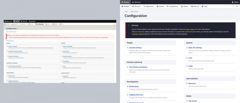
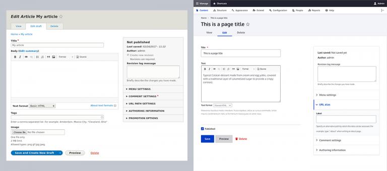
On the admin side, the Claro theme was rolled out with Drupal 8.8. While the existing admin theme, Seven, was perfectly usable, it was originally designed in 2009, and received only minor touch-ups since then. Claro, by comparison, looks dramatically more modern and elegant, employing a brighter, cooler, more high-contrast color palette and a more refined typographic treatment. Functionally, not much has changed from Seven–continuity is valuable in itself, and the Claro design team didn’t want to change anything for the sake of changing it. Instead, they optimized what was already working in Seven with regard to the UX, and dressed it in a modern UI. The visual changes that Claro brings not only serve to create a more pleasant user experience; indeed they make the theme accessible to more users, with bigger fonts and increased contrast. Some non-visual enhancements, such as the ability to navigate the admin interface exclusively with a keyboard, also make Claro more accessible than Seven. Finally, the Claro design team focused on cross-browser compatibility and responsiveness for mobile devices. Again, Claro not only looks great, it’ll look consistently great for more users across more devices.

This pair of new themes will undoubtedly go a long way to improve the user’s initial impression of Drupal, both in the way that content is presented as well as how it is managed. They bring highly visible changes that will have a positive impact on the user experience, even if they represent relatively incremental changes from a strictly functional perspective. Indeed, they speak to the fact that Drupal is already a best-in-class platform–scalable, feature-rich, and flexible–and while expert users know that, beginner users should as well, and an inviting and modern UI will help them discover that, especially with the enhancements in Drupal 9.
Drupal Website at Work:
