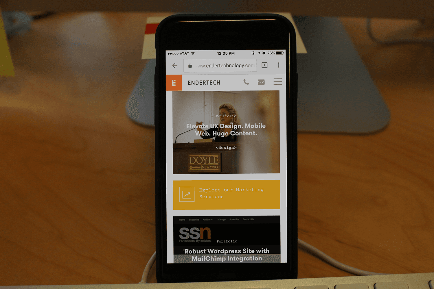
Why Go Mobile?

Asking today whether you need a mobile presence, is like asking in 1999 whether you need a website. People are seeking out the vendors and information they need at all times and at all place these days thanks to the incredible growth of mobile networks and mobile devices.
If you want to maximize your business opportunities, even if your online presence is nothing more than a brochure generating leads for your business, you need to develop it for a mobile audience.
Mobile App vs Mobile Web
There are two primary way’s to develop the online component of your business for mobile: build a mobile app, or build a mobile website.
The best choice for you depends on a few considerations. What is it that you want to achieve with your mobile presence? Are you imagining it primarily as an information source about your business, similar to what is on your current website? Do you want to be easily found by mobile searchers? Then you’ll probably just want to mobile optimize your website using a technique known as responsive design.
Are you instead imagining something a bit more sophisticated? Is there a functional or interactive component of your business that you think would work well in a mobile context? Are there customer specific feature or dynamic information that they would be coming back for regularly? In this case, you might consider developing a mobile app over a mobile site, so that a more permanent fixture is installed on your customer’s devices, and so that the interface can be a bit smoother and more integrated into the mobile device.
Responsive Web Design for Mobile Websites
Responsive web design is a front-end web development technique that uses a feature of CSS3 called media queries to adjust the layout of a page according to the size of the viewport rendering the page. For instance, your phone probably has a viewport of about 480px. Your tablet might be 640px or 800px depending on whether you have it oriented portrait or landscape. Your laptop or desktop probably have a viewport of 1000px or more depending on how wide you open your browser.
Of course, on you computer, you can also shrink your browser window down to the size of a phone, and in many sites, you can see whether they are responsive that way. Go ahead and try it now on our site!
The essential wisdom behind responsive design is that it allows you to have a mobile optimized browsing experience (no pinching or panning), with minimal additional coding. You don’t need to build and maintain a totally different website. With a smart infrastructure and the use of CSS3 media queries, you can have codebase that delivers optimal viewing of your content across all devices and browsers. The time and cost efficiency of this should be obvious.
The design trick of quality responsive design includes knowing what to do with menus, and how to intelligently stack elements. Since mobile optimized experiences generally include a lot of vertical scrolling with no pinching or panning, the order of stacking elements becomes important. Also, since navigation menus are typically sideways oriented, or laid out in a column, how you collapse menus and enable navigation becomes a critical part of your mobile design.
The development trick of great mobile web design is much like the trick of great web design back in the dial up days. Since mobile networks are typically high latency and low bandwidth compared with wired networks, a great mobile experience will deliver the minimum number of bytes needed to render the requested content. This will be accomplished through compression, caching, CDN utilization, and flat out smart programming.
Mobile App Development
If you and your design team have determined that a mobile app is the way to go for your needs, the next question is to determine how to build that app. Surely you want to support both iOS and Android devices, yet each has its own programming language and software development kit (SDK).
In many cases, you really need not write the code for your app twice, once in each native platform.
Unless your app is taking advantage of some very low-level components of the system hardware or SDK, you can probably achieve your desired results using a solution like Ionic Framework, which leverages a build environment called Cordova to generate apps for each device type. The beauty of this system is that using only common web languages,
Javascript, HTML, and CSS, you have have one codebase, and still generate native apps for any device!
Similar to the application of responsive design techniques to your website, using Ionic Framework creates major efficiencies that save time and money.
Go Mobile!
https://endertech.com/contact/
Let’s Talk!________________________ Endertech has has been designing and developing database-driven web apps for 15 years. Contact us today for a free consultation about your web project!

