The internet is for everyone — but not everyone accesses it in the same way. According to the CDC, 1 in 4 adults in the U.S. lives with a disability such as vision, hearing, cognition, movement, or speech impairment that impacts their activities in a major way. Platforms are making improvements to more easily meet standards. Shopify ADA Compliance in Hydrogen is one example we’ll focus on here.
Disabilities can affect the way people use technology and interact with websites. Thus, the World Wide Web Consortium provides a set of guidelines called the Web Content Accessibility Guidelines (WCAG) 2.0 to ensure the internet remains inclusive and accessible for everyone.
The WCAG 2.0 provides recommendations to ensure websites are perceivable, operable, understandable, and robust. And Shopify Hydrogen gives you everything you need to build your website according to those recommendations.
This article explores accessibility best practices you should follow as you build a Hydrogen app.
Five Accessibility Best Practices for Shopify Hydrogen
Before we begin, it’s worth mentioning that these practices are a starting point for building accessible storefronts. Following these Shopify Hydrogen accessibility best practices alone won’t make your storefront accessible.
Therefore, consider using one of the following tools to identify accessibility issues in your Hydrogen app:
1. Prioritize keyboard accessibility
Keyboard accessibility is one of the first things you should consider when building a Hydrogen app. Users with visual or motor impairments often rely on traditional and specialized keyboards to navigate websites.
Therefore, you should ensure your Shopify Hydrogen storefront allows shoppers to access all buttons, links, and form controls using a keyboard.
Incorporate basic keyboard navigation techniques such as:
Tab or the Down and Right arrow keys to navigate forwards.
Shift + Tab or Left and Up arrow keys to navigate backward.
Enter to click elements.
Arrow keys to navigate related elements.
Use a focus indicator that’s clearly visible on active elements using both a keyboard and a mouse. Similarly, make sure zooming gestures are always available, and features that require multiple fingers or complex actions can be executed with a tap or click.
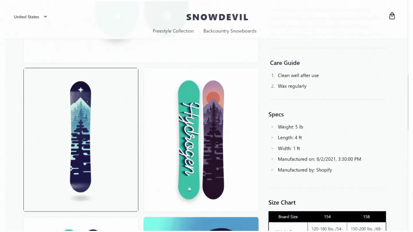
Here’s an example of how Shopify’s demo product page handles keyboard focus and navigation for a 3D rendered product image:
2. Page and Content Structure
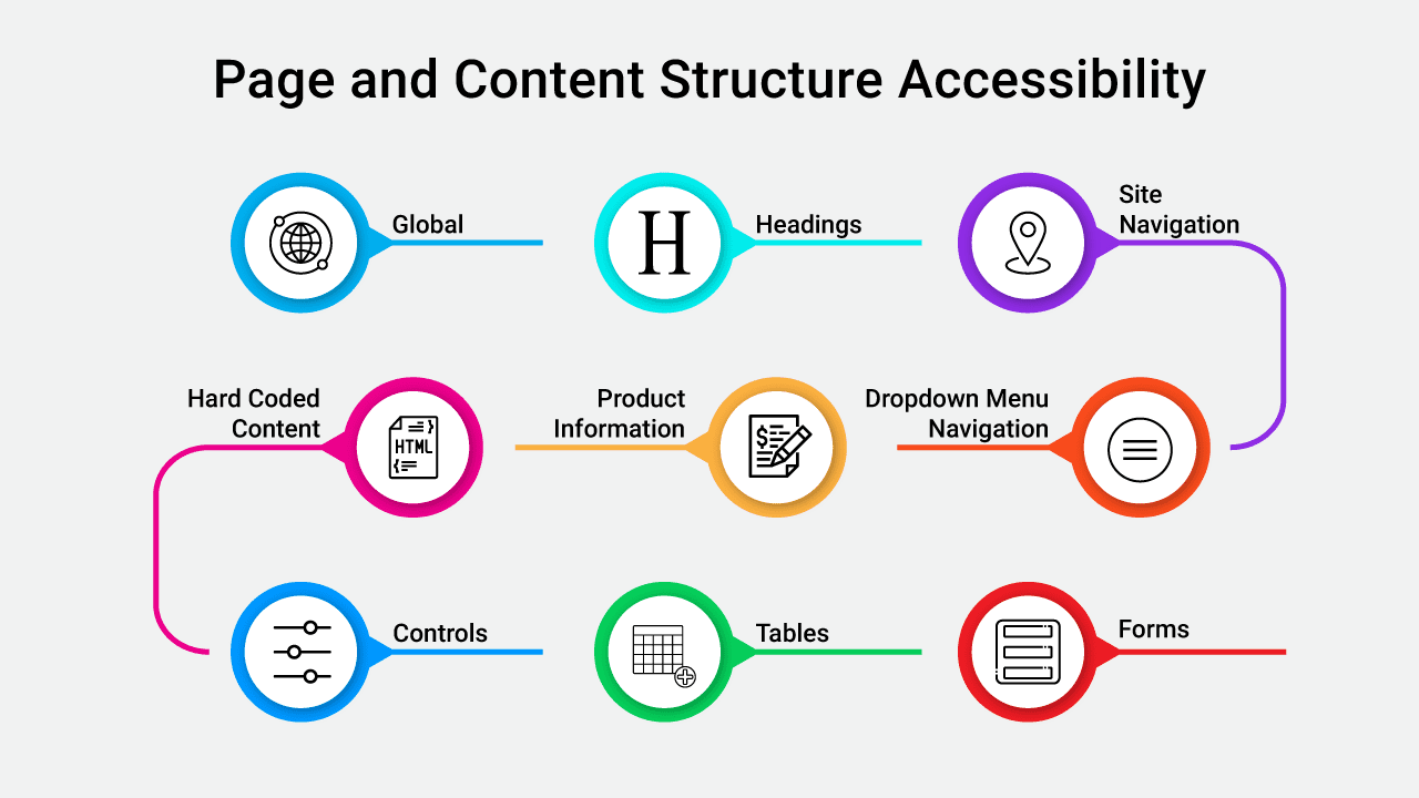
Once you’ve addressed keyboard accessibility, it’s time to shift your attention to your Hydrogen app’s page and content structure.
Well structured pages are essential for several reasons, including:
They make it easier for people with visual, cognitive, and learning disabilities to find content.
They allow people using screen readers to navigate to important sections.
They help people using keyboards to browse pages and sections more easily.
They help search engines read, understand, and index your page contents.
Let’s explore best practices for the most crucial elements of your Hydrogen store:
Global
Set the page lang attribute correctly to ensure that screen readers can access your store content in the correct language and dialect. Provide a “Skip to content” link for instant access to page content and include tabindex=“-1” on your storefront’s main container to receive focus without putting it in the tab order of the page.
If you fail to include tabindex=“-1”, keyboard users will need multiple key presses to use the link which can hurt the UX and make your site difficult to use.
Keep your content flow linear and avoid using positive tabindex attribute values so shoppers can interact with your page organically. Finally, enable viewport zoom to allow customers with visual disabilities to manually zoom in and out on your site.
Headings
Use HTML heading tags and markup to organize your page content for humans and search engine robots. More importantly, use heading tags logically to demonstrate content hierarchy and restrict the h1 tag to the page title.
Site Navigation
Wrap navigation areas (sections containing links to other pages on your site) using the nav HTML element and use the aria-current attribute to highlight the current page link.
Additionally, avoid using role=“menu” and role=“menuitem” attributes for navigation items as they inform screen readers that the element is a menu instead of a navigation element. If it’s not a menu, it shouldn’t behave like one.
Dropdown Menu Navigation
If you’re using collapsible navigation on your site, use the aria-expanded attribute to convey the state of the navigation item. Additionally, follow standard conventions for keyboard accessibility such as:
Enter and Space to open the dropdown menu.
Tab to descend into the first menu item.
Esc key to collage the menu.
Product Information
Include alt texts for all product images. Not only does this help describe the image to users with visual disabilities, but it also provides search engine crawlers with more context. Use markup to identify regular and sale prices for screen readers and style them differently using CSS.
If the product page updates prices dynamically, use the aria-live attribute to communicate changes in the UI.
For example, suppose you offer tiered discounts that update the product price based on quantities selected by customers. In that case, ensure any changes in the price displayed are communicated to the screen reader as well.
Hard Coded content
The primary goal of using React to build an online store is to leverage its dynamism. Thus, you should avoid hard coding content in your Shopify Hydrogen storefront.
Build your store with translation and localization in mind — even if you don’t need it immediately. When you start selling globally on Shopify, you’ll be able to offer accessible content even with localization.
Controls
Use links on your storefront to allow shoppers to navigate your site, load new pages, and shift focus between elements. And for on-screen actions such as launching a modal window, use the button element.
Follow best practices of using links, such as a visual icon to identify links that open in a new window and descriptive anchor texts, so users know what to expect after they click.
Tables
When building tables, use the table element for all table data and the caption element to alert users with screen readers that a table is being read.
Forms
If you’re using forms, include a label that clearly states the form’s purpose and mark mandatory fields with the required attribute. You can also use the autocomplete attribute to allow customers to fill form fields using data from their browser.
When customers submit a form, any error or feedback should be communicated to screen readers instantly using the aria-live attribute. At the same time, make sure all error messages are clear, concise, and descriptive and the focus shifts to the feedback message immediately in case of errors.
3. Store Media
Using media is a great way to highlight your product’s USP and increase sales. However, it can also be distracting and disruptive if incorporated incorrectly.
Follow these rules when incorporating media on your Hydrogen storefront:
Respect the prefers-reduced-motion media query used by customers to minimize non-essential motion.
Include a pause button that activates with the Space key for sliders and videos.
Assign alt attributes to product and content images and use empty alt values for decorative images.
Add closed captions to videos and ensure auto-play starts with the audio muted.
4. UI Color and Contrast
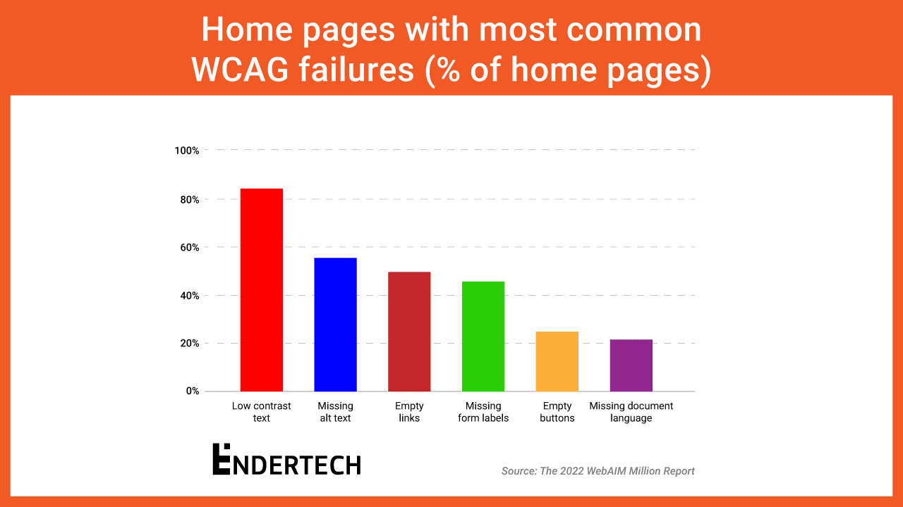
A 2022 report by WebAIM found that nearly 97% of the top 1 million websites in the world suffer from accessibility issues. And that’s not all. The most common WCAG failure type detected on 83.9% of all home pages was low contrast text.
When choosing your storefront color palette and incorporating it across your website, make sure that all text and design elements remain accessible to customers with visual impairments.
More specifically, aim for the 1.4.3: Contrast (Minimum) Success Criterion as outlined by the WCAG. Use a free online contrast checker to ensure your chosen colors meet WCAG’s guidelines.
5. Dynamic Component Design
Like store media, dynamic components such as slideshows and predictive search can both help and hurt your website accessibility. The key to avoiding a poor user experience is to use elements that allow keyboard navigation, provide context, and support screen readers.
When using slideshows on your Shopify Hydrogen storefront, include keyboard-accessible pause, play, and navigation buttons. For popup elements like modals, shift the focus to the modal label when it’s active and allow using the Esc key to close the modal.
Build Inclusive Shopping Experiences with Shopify Hydrogen
Building accessible storefronts isn’t just about meeting Shopify ADA Compliance in Hydrogen — it’s about building inclusive shopping experiences for everyone.
With a React-based framework and Shopify-friendly components, hooks, and utilities you have everything you need to achieve that goal in Shopify Hydrogen.
Have more questions? Jump on a call with our Shopify experts to learn how we can build an accessible storefront for your online business.