The Shopify Checkout Page Layout - Is it a Big Deal?

As a designer and frontend developer, having control over every aspect of the user interface and experience is optimal. Endertech’s clients often have specific business goals or functional requirements, and these can inform the design of their website’s UI in order to funnel users toward a certain end goal: a subscription, a contact form submission, etc.
This is why, in my first project on the Shopify ecommerce platform, I was disappointed to find out that unless you’re a high-volume enterprise merchant (and able to pay at minimum $2,000 per month for Shopify Plus), Shopify does not let you significantly customize your shop’s checkout page.
While you’re allowed to make some basic configurations, such as specifying certain UI colors and adding your logo, you cannot change the layout to the extent that you can with the other pages on your site, where you have access to the Liquid template files. The result is that the majority of Shopify sites have essentially the same checkout page.
It can be frustrating as an ecommerce merchant to spend time thoughtfully envisioning and building your shop’s user experience only to have the user be pulled out of that journey with an off-the-shelf checkout experience. Despite this, however, I have concluded that this limitation isn’t quite the drawback it seems at first, and that for most merchants, the standard Shopify checkout page works perfectly well.
"Unless you’re a high-volume enterprise merchant, Shopify does not let you significantly customize your checkout page."
Why the Shopify Checkout Page Limitations?
First, it’s important to understand some of Shopify’s reasons for implementing this restriction in the first place. An obvious one is that making a custom checkout page a premium feature makes Shopify Plus more attractive to merchants for whom a completely branded site or bespoke end-to-end user experience is important.
There are some practical reasons for this limitation, too, though. Because Shopify is a subscription service, a proprietary platform on which thousands of websites are built, it must comply with a vast array of different security, accessibility, and other regulations. Having a common checkout page on most of its stores streamlines development and maintenance for Shopify and, again, justifies making heavy customization a premium feature.
Additionally, the truth is that however else you customize your ecommerce site’s user experience, once the user lands on the checkout page, the only goal as a merchant is for the user to complete their checkout.
Most ecommerce sites don’t require reinventing the wheel of the checkout experience; there are certain tried-and-true elements that help drive conversion rates. Indeed, because Shopify hosts so many sites with a common checkout page template, it has been able to optimize the design for conversion. So, a limitation from one angle begins to look like a selling point from another.
How Is the Shopify Checkout Page Optimized For Conversion?
The Shopify checkout page ticks a lot of the elements that make for a high-converting user interface. A few of the most important ones are:
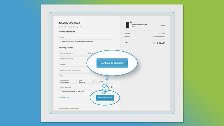
A single, clear call to action
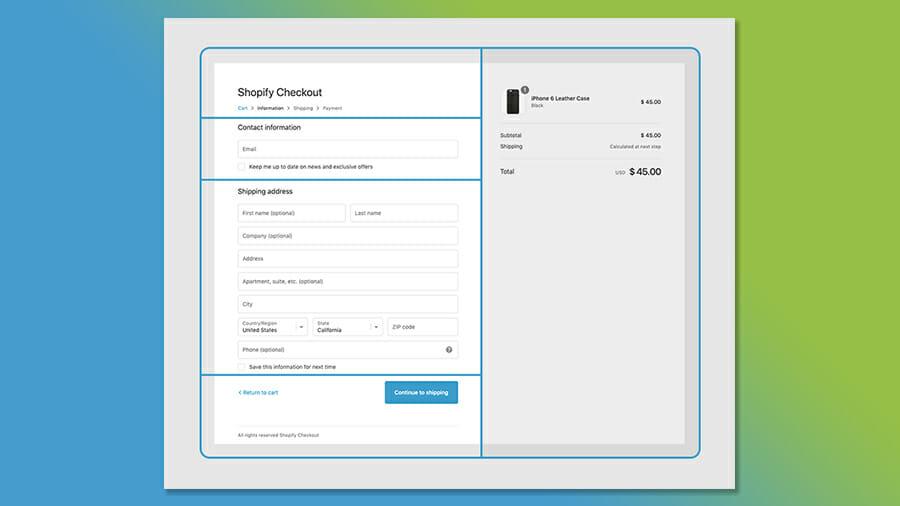
A logically organized layout, with related functions grouped and a clear hierarchy of information
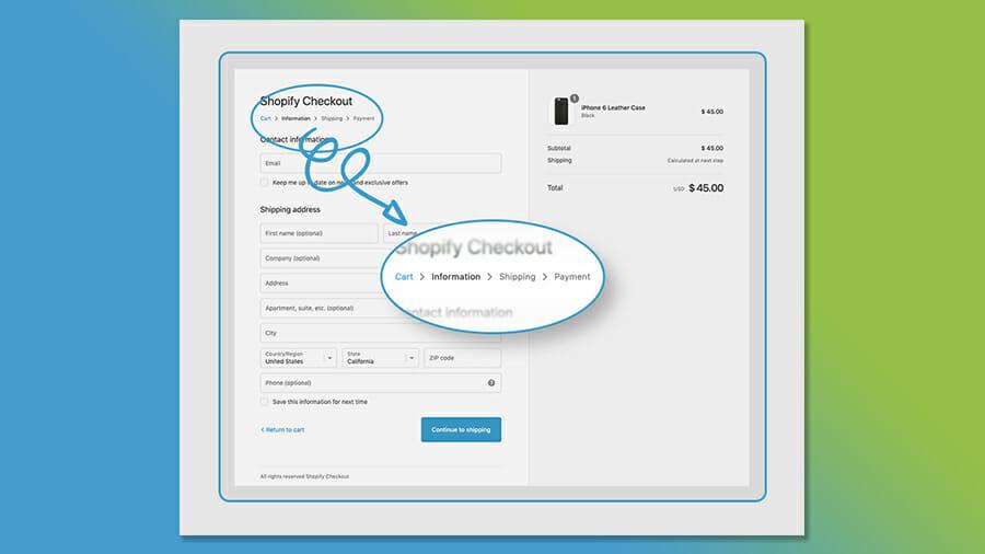
Signposts that orient the user within their current workflow
In more detail…
#1 Clear Call to Action

The “Continue to shipping” call to action is the most visually striking element on the page. If there is one available action the user will see, it’s the big blue “Continue to shipping” button, which will help ensure the user is propelled forward in the checkout process. “Return to cart” is available, since Shopify is not completely draconian about isolating the checkout pages from the rest of the site, but it is nonetheless minimized.
#2 Logically Organized Layout

Making the “Continue to shipping” button is one example of Shopify’s designers inserting information hierarchy into the checkout page layout. Beyond the primary call to action, the layout is organized in a logical way, with the position and visual attributes of its various elements both determined by and reflecting their relative importance, as well as their relationships to each other.
For example, the main visual division in the layout is a result of the designers separating the inputs and the outputs. The information the cart outputs (e.g., shipping price, taxes, total cost) will be affected by the information the user inputs as they enter their address, shipping preferences, and payment method, but these changes will be easy to see because the outputs are grouped together and their position on screen remains consistent from page to page as the user moves forward in the checkout process.
#3 Orienting the User in the Workflow

One of the most important axioms in UI and UX design is that the user should never feel lost. In the context of an ecommerce site, the user should always know where they are in the site as they move from the home page to the product listing or product category page, to the product detail page, and onward through the checkout. Once in the checkout process, the user should feel like they’ve moved away from the main site and have entered a one-way workflow.
This process potentially requires a lot of input from the user (assuming their shipping, payment, and other details aren’t already saved) and any level of frustration might lead them to abandon the checkout. That’s why it’s critical to keep the user oriented as they move through the checkout process; they shouldn’t feel like there are too many steps or like they don’t know how many pages are left before they can submit their order.
In this respect, Shopify has cut out any extraneous functionality to reduce “friction” in the checkout process, and additionally provides various signposts in the UI to orient the user.
"It’s critical to keep the user oriented as they move through the checkout process; they shouldn’t feel like there are too many steps before they can submit their order."
In Conclusion…
While it can be seen as a drawback of the platform, in reality most ecommerce merchants, especially those drawn to Shopify in the first place, do not have functional needs not fulfilled by Shopify’s common checkout page. Furthermore, because hundreds of thousands of online stores use the same checkout page, Shopify has been able to analyze the UI and optimize it for conversion—and that’s the most important aspect of a successful page design.
