What is CSS Grid?
CSS Grid is a system that allows web developers to create complex webpage layouts. It is a result of many iterations of HTML and CSS, all leading towards allowing designers and developers to create more creative and flexible webpage layouts.
The Evolution of Webpage Layout Technologies
It was a bumpy road that finally led us to the development of CSS Grid. Before CSS Grid, we have tables, then divs+floats, then positioning, then flexbox, and finally CSS Grid. Each advancement was based on shortcomings of the previous.
In the old days developers would often use <table> tags to create layouts. Using colspan and rowspan would allow some more complex designs to be used. This worked OK for very basic early pages in the 1990s, but as pages became more complex and sophisticated, this practice became more and more limiting. Major drawbacks included:
Accessibility: screen readers consider tables to represent tabular data, not an entire website’s structure. Readers and assistive tech will try to describe the data within the table to the user, and it becomes an incoherent mess.
Responsive Design: when mobile came along, sites basically needed two different designs based on device width. Table layout cannot be changed based on device differences.
Maintenance Pains: Any design change could lead to a cascading set of side effects that would lead to major infrastructure changes that would need to be dealt with.
Performance: the browser has to calculate the entire structure of the table before it can start drawing elements within, and some elements might trigger a reflow and expensive recalculations.
In general, tables represent data, not website layouts, and an entire host of problems resulted from attempting to use it as such.
After that came divs and the ability to float them left or right, as well as the ability to absolutely position them. This allowed developers to create more flexible and semantically correct layouts, but also had a ton of issues. It was rather frustrating to work with and still didn’t lead to graceful responsive designs. Also keep in mind, developers had to deal with Internet Explorer and a number of other browsers each with their own idiosyncrasies. Development was time consuming and real exercise in frustration at times.
To address all the issues with floats and positioning, along came flexbox. Flexbox was great and allowed advanced layout and positioning without the hacks and pain of floating divs. But flex had a problem as well, it only handled one dimension. You could make a layout of a row or column look nice, but any subsequent rows or columns had no knowledge of those before or after them. So you couldn’t have a 2D grid that maintained a common row or column size relative to previous rows and columns unless you specifically set width and height. The core issue was the content couldn’t determine consistent row and/or column sizes.
To solve that, we finally see CSS Grid arrive and now complex responsive layouts can be created with relative ease. I say relative because there is a bit of a learning curve when first starting out with CSS Grid.
CSS Grid Examples
I believe real world examples are the best ways to learn, so let’s take a look at some examples starting from the most basic to more complex 2 dimensional layouts, and even some shifting of cells between mobile and desktop.
Example 1: a 1x1 grid
<style>
.container {
display: grid;
place-items: center; /* positioning */
aspect-ratio: 16 / 9; /* aspect ratio */
grid-area: 1 / 1; /* overlay items */
}
.item {
background: #cfc;
padding: 20px;
}
</style>
<div class="container">
<div class="item">Hello 1x1 grid!</div>
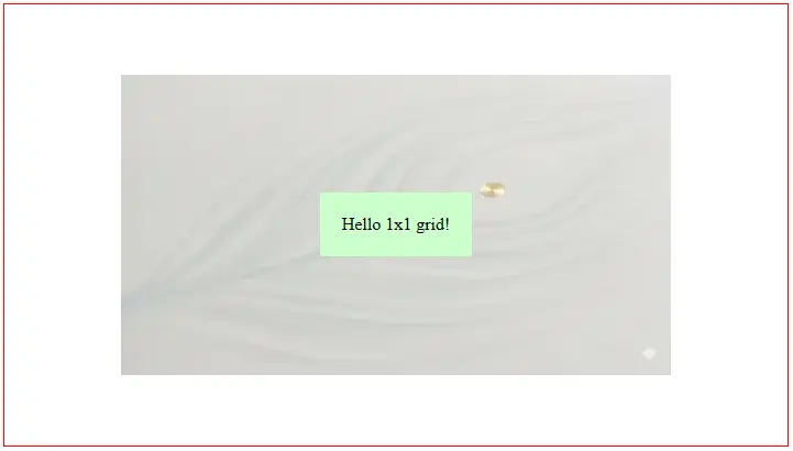
</div>This basically renders the same as a simple <div></div> element, except it has some advanced centering, overlay, and aspect ratio capabilities. The item will be centered vertically and horizontally, the container will take on a 16/9 aspect ratio, and any elements inside will overlay on top of each other. If you removed these three, the element would behave just like a basic <div>.
Rendered
Example 2: a 2x2 grid
<style>
.grid {
display: grid;
grid-template-columns: 1fr 1fr; /* two equal-width columns */
grid-template-rows: 1fr 1fr; /* two equal-height rows */
gap: 10px;
border:2px solid red;
background: lightblue;
height: 200px;
}
.cell {
display:grid;
place-items:center;
background: lightgreen;
font-weight: bold;
}
</style>
<div class="grid">
<div class="cell">1</div>
<div class="cell">2</div>
<div class="cell">3</div>
<div class="cell">4</div>
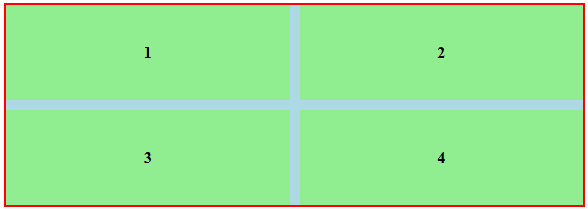
</div>In this example we see a bit more complexity. We see the first use of grid-template-columns and grid-template-rows. These tell the grid how much of the space each row and column should take. As well, we’re using the same centering technique used in example 1 to center the copy in each cell.
The grid-template-rows and grid-template-columns properties need a bit more explaining, and this is usually the most confusing aspect for CSS grid newcomers. Let’s start with grid-template-columns, this represents the fractional value of elements that make up the full width of each row (i.e., the width of each column). For example, 1fr 1fr means there are two columns and each takes 50%. Think of it like this, take the sum of the numerators and use that as the denominator for all. So for 1fr 1fr, 1+1=2, so each one is 1/2, or 50%. If you did 2fr 1fr, then the sum is 2+1=3, so the cell widths are 2/3 and 1/3.
You can also use fixed units like px. If we did ‘100px 1fr’, then the first column would be 100px and the second would take up the remaining space. Doing ‘auto 1fr’ would have the first column width set by the content, and then the second column takes all remaining space.
Rendered
Example 3: a dynamic responsive layout
This is where CSS Grid really shines. In the past, if the mobile layout differed a lot from the desktop you either had to modify the design or do unsavory things like hide/display sections or swap content using javascript.
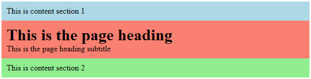
Here is an example layout, we’ll start with mobile since mobile-first is a best practice for page speed:
<style>
  h1, p {margin:0}
  div {padding:10px}
  .heading {background:salmon}
  .sect1 {background:lightblue}
  .sect2 {background: lightgreen}
</style>

<div class="container">
  <div class="sect1">
    This is content section 1
  </div>
  <div class="heading">
    <h1>This is the page heading</h1>
    <p class="subtitle">This is the page heading subtitle</p>
  </div>
  <div class="sect2">
    This is content section 2
  </div>
</div>
This just renders as stacked DOM elements, perfect for mobile portrait:
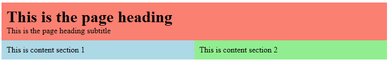
But what if the desktop layout requires the heading first at full width, then the blue and green ‘content section’ columns below with 50% width each (two columns). You could almost do this with flex and order, but CSS Grid is going to make this very simple and consistent.
We add a media query and tell CSS Grid how we want it laid out:
<style>
  h1, p {margin:0}
  .container > div {padding:10px}
  .heading {background:salmon}
  .sect1 {background:lightblue}
  .sect2 {background: lightgreen}
  @media (min-width: 768px) {
    .container {
      display: grid;
      grid-template-columns: 1fr 1fr;
    }
    .heading {
      grid-column: 1 / span 2;
      grid-row: 1;
    }
    .sect1 {
      grid-column: 1;
      grid-row: 2;
    }
    .sect2 {
      grid-column: 2;
      grid-row: 2;
    }
  }
</style>
Changes:
.container is displayed as a grid, and the layout is defined as two columns of equal width.
.heading is then set to row 1 and spans 2 columns
.sect1 is set to row 2, column 1
.sect2 is set to row 2, column 2
Rendered
And there is actually a more visual way to accomplish this same layout change, let’s look at the CSS for that:
/* assign grid area names to the divs */
.heading { grid-area: gaHeading; }
.sect1   { grid-area: gaSect1; }
.sect2   { grid-area: gaSect2; }

@media (min-width: 800px) {
  .container {
    display: grid;
    grid-template-columns: 1fr 1fr;
    grid-template-areas:
      "gaHeading gaHeading"
      "gaSect1   gaSect2";
  }
}
The key here is to assign names to each grid element, referred to as a ‘grid-area’ in CSS. So we assign human-readable labels of ‘gaHeading’, ‘gaSect1’, ‘gaSect2’. Then instead of all the direct assignment of rows and columns, we just lay them out visually in the CSS itself. In this case we have ‘gaHeading’ repeating across both columns to indicate it spans those columns, and then we have ‘gaSect1’ on the left and ‘gaSect2’ on the right representing the columns below ‘gaHeading’. This really helps with more complex layouts instead of trying to keep all rows, columns, and spans organized and defined.
Well there you have it. A brief history on the evolution of the layout tools available in CSS, as well as concrete examples on how to use the ultimate layout tool, CSS Grid!