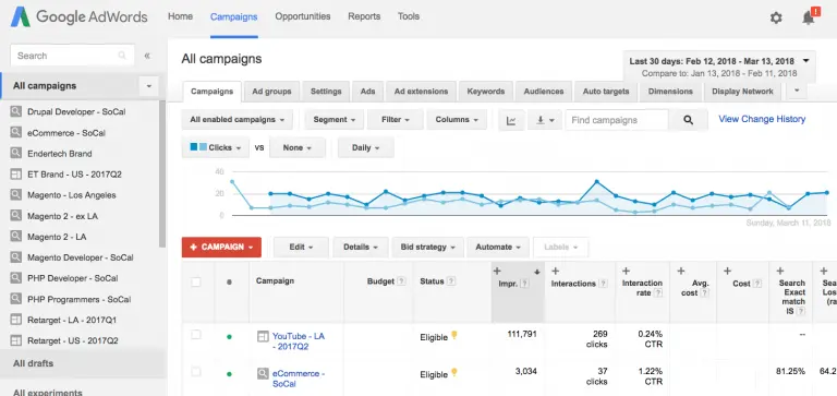
With apologies to Bing Ads, whom I greatly respect as well, the standard bearer for efficient, intuitive, and functional pay per click UI (user interface) has always been Google AdWords. With that said, Google has been rolling out their new UI while allowing those of us who wish, to persist with using the prior AdWords “experience”.
However, our time as holdouts is inching toward its finale as Google continues to roll-out feature updates, making them available in the new UI. Recently, AdWords introduced a custom columns expansion, making them available at keyword and ad levels. This feature has been available since 2014 but only at the campaign and ad group levels until now. Custom columns allows the addition of selected additional columns of metrics to help run a campaign. It displays important criteria one can use to make decisions for how to manage and optimize elements in the account.
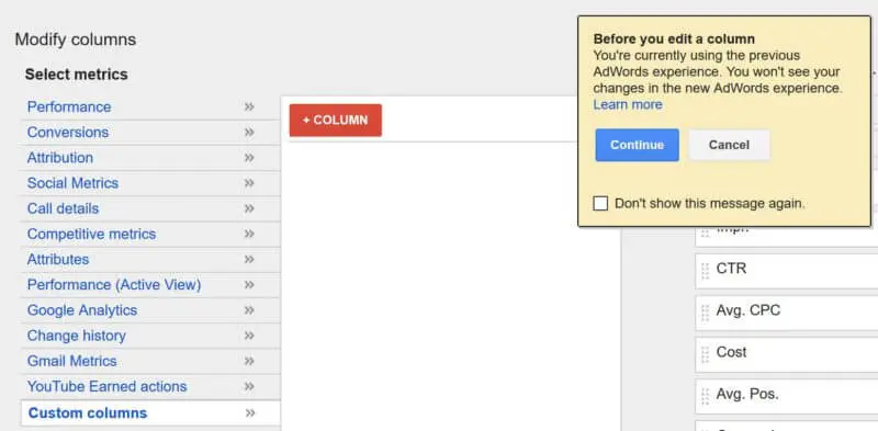
However, if you try to enable this feature in the old UI, you get this warning about how your settings will not port over to the new UI:
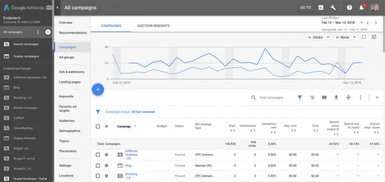
This is just one more sign that the deprecation of the old UI is coming closer and soon will be the exclusive AdWords experience available. As such, it’s time to begin to accept the new UI, which while designed for greater efficiency turns, feels kind of clunky and as such requires some time to get used to. By redesigning the interface to make more frequently used features easier/faster to access, Google’s idea is to speed up the time to complete routine tasks. It is one of the biggest changes in visual appearance since the launch of AdWords.
Those who have made the switch find the new AdWords interface to be a big improvement. The revamped features facilitate smooth navigation, helping with quick decision making. Better categorization of features has added an aesthetically pleasing look to AdWords.
Among the changes in the new UI are a refined dashboard display, easier managing of bid adjustments, promotion (discount offers) extensions, improved visualization tools like charts, graphs, heat maps, better tools for ad extensions and demographic targeting, and consolidation of reporting into a single section. Reporting is a notable area of improvement, which had been frustrating in the old UI. For example, previously there was a report type known as ‘Dimensions’. What does that even mean? It has now been renamed to ‘Predefined’, which is more intuitive, as it contains a series of predefined most common reporting metrics like spend, impressions, clicks, and conversions.
Conclusion Google has bundled up similar elements in one place and the new interface saves time with quick and easy drag and drop options. It’s designed to be more intuitive, more efficient, and more informative. It’s been available in beta form for a year providing time to gently make the transition. Now, who moved my cheese?