Introduction
This article branches off from a previous introduction to React Admin and how to extend it. If you need a refresher to React Admin, you can read the first article or explore React Admin’s documentation page. In this tutorial, I’ll explain how to order nested data entities with draggable rows in React.
More specifically, we are going to:
Download a starter repository on Github
Customize the React Admin data display properties
Implement drag-n-drop using Material-UI and react-beautiful-dnd
Query the React Admin data provider to save the data after it’s “dropped”
Adding draggable rows in Reach are a simple way to create a rich user interface for your React Admin projects, so I’m excited to get started.
Prerequisites
There are a couple of prerequisites that this tutorial requires:
Understanding of how ReactJS works
Basic networking jargon (i.e., request, API call, fetch)
How to open and use the command line on your OS
Code editor (i.e., VSCode, Sublime Text, Atom, Vim)
I am using VSCode on a macOS system. If you need help along the way, check out the complete repository on Github for guidance.
Download Starting Repository
To download the starter template, open up a new terminal (command-line) and navigate to where you want to place the repository.
Then, execute the following command to clone the repo.
git clone https://github.com/jdretz/starter-template-react-admin-draggable-rows.git react-admin-drag-n-drop
Change directories into the new repository and install the dependencies.
cd react-admin-drag-n-drop yarn install
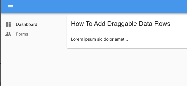
Finally, after downloading all the packages, run yarn start to run the application. A new browser should open up to http://localhost:3000, and you’ll see the app’s dashboard.
Project Overview
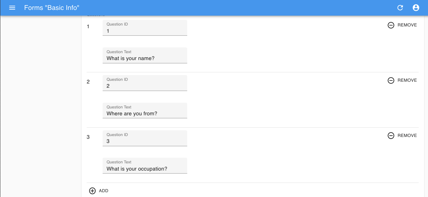
The application has one central resource: Forms. Users can add, remove, delete, or edit a form. Nested inside each form are a few simple data fields.
If you click the inline Edit button on a form, the app takes you to the edit view for that form. There, you can edit or view the form’s:
ID
Title
Questions
Furthermore, the Questions field is an array where you can add, edit, or delete the questions on each form.
The app retrieves the data from your browser’s local storage with the help of a mock service worker. The service worker has a series of handlers (at src/mocks/handlers.js) that intercepts requests from the custom data provider (in src/dataProvider.js).
Therefore, if you ever need to reset the data during this tutorial, you can go into your browser’s developer tools, navigate to local storage, and delete the “forms” item.
Using a mock service worker as a data provider is not something that you should do in production. However, it’s convenient for the tutorial.
Customize Array Input Component
The view components for the Forms resource are inside src/forms.js.
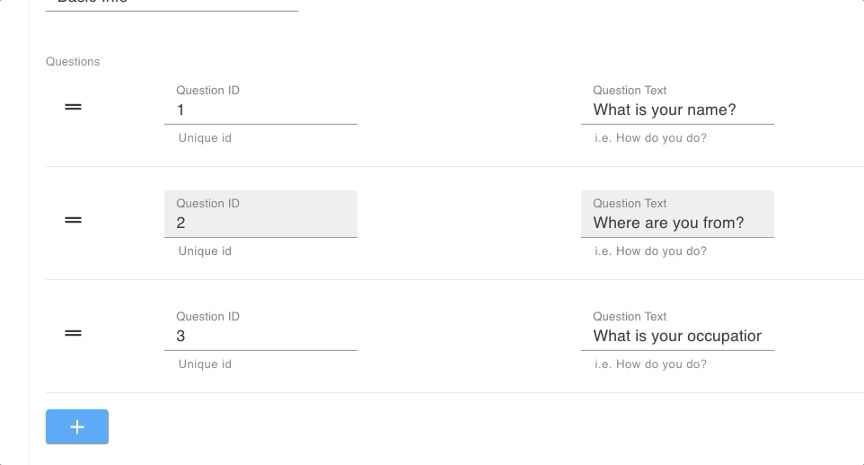
The <FormsEdit> component holds the array input where we want to implement the drag-n-drop.
... export const FormsEdit = props => ( ... <ArrayInput source="questions"> <SimpleFormIterator> <NumberInput label="Question ID" source="id" /> <TextInput label="Question Text" source="text" /> </SimpleFormIterator> </ArrayInput> ... ) ...
Create a new file in the src director named CustomIterator.js.
Inside CustomIterator.js add the code below:
import React from 'react'; import { FieldArray } from 'react-final-form-arrays'; import { TextInput, NumberInput } from 'react-admin'; import Add from '@material-ui/icons/Add'; import Button from '@material-ui/core/Button'; const CustomIterator = ({ record }) => { return ( <FieldArray name="questions"> {(fieldProps) => { return ( <> {fieldProps.fields.map((question, index) => { return ( <> <NumberInput helperText="Unique id" label="Question ID" source={`questions[${index}].id`} /> <TextInput helperText="i.e. How do you do?" label="Question Text" source={`questions[${index}].text`} /> <Button style={{ color: 'red' }} type="button" onClick={() => fieldProps.fields.remove(index)}> Remove </Button> </> ) })} <Button type="button" onClick={() => fieldProps.fields.push({ id: '', question: '' })} color="secondary" variant="contained" style={{ marginTop: '16px' }} > <Add /> </Button> </> ) } } </FieldArray> ) } export default CustomIterator;
In a moment, I’ll explain what’s changed, but first—back in forms.js—import the custom iterator and use it to replace the <SimpleFormIterator>.
... export const FormsEdit = props => ( <Edit title={<FormsTitle />} {...props}> <SimpleForm> <TextInput source="id" disabled /> <TextInput multiline source="title" /> <ArrayInput source="questions"> <CustomIterator /> // new </ArrayInput> </SimpleForm> </Edit> ); ...
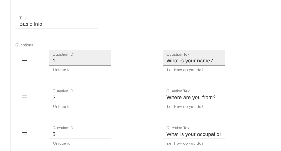
Save the file, and take a look at the new iterator.
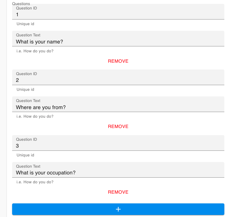
It’s lost some of its visual appeals. But, we gained access to the inner iterator component. Moving forward, we can customize the iterator inside of the <CustomIterator> component while working within React Admin’s workflow. Per the documentation;
“
<ArrayInput>expects a single child, which must be a form iterator component. A form iterator is a component accepting afieldsobject as passed by react-final-form-array, and defining a layout for an array of fields.”
Under the hood, React Admin uses the react-final-form-arrays library to create the form iterator. Consequently, we can re-engineer parts of the component using components straight from that package.
In the custom iterator, it’s worth noting that sourcing the suitable properties for inputs became more complex, but we can still use dot notation to access nested elements.
Defining a Material-UI Table Layout
Next, Material-UI components provide us a table layout and drag icon. The next step uses Material-UI’s:
<TableContainer>
<Table>
<TableBody>
<TableRow>
<TableCell>
Wrap the current custom iterator elements with the appropriate components.
… other imports import Table from '@material-ui/core/Table'; // new import TableBody from '@material-ui/core/TableBody'; // new import TableCell from '@material-ui/core/TableCell'; // new import TableContainer from '@material-ui/core/TableContainer'; // new import TableRow from '@material-ui/core/TableRow'; // new import DragHandleIcon from '@material-ui/icons/DragHandle'; // new const CustomIterator = ({ record }) => { return ( <FieldArray name="questions"> {(fieldProps) => { return ( <> <TableContainer> // new <Table aria-label="questions list"> // new <TableBody> // new {fieldProps.fields.map((question, index) => { return ( <TableRow hover tabIndex={-1} key={index}> // new <TableCell> // new <DragHandleIcon /> // new </TableCell> // new <TableCell align="left"> // new <NumberInput helperText="Unique id" label="Question ID" source={`questions[${index}].id`} /> </TableCell> // new <TableCell align="left"> // new <TextInput helperText="i.e. How do you do?" label="Question Text" source={`questions[${index}].text`} /> </TableCell> // new <TableCell align="right"> // new <Button style={{ color: 'red' }} type="button" onClick={() => fieldProps.fields.remove(index)}> Remove </Button> </TableCell> // new </TableRow> // new ) })} </TableBody> // new </Table> // new <Button type="button" onClick={() => fieldProps.fields.push({ id: '', question: '' })} color="secondary" variant="contained" style={{ marginTop: '16px' }} > <Add /> </Button> </TableContainer> // new </> ) } } </FieldArray > ) } export default CustomIterator;
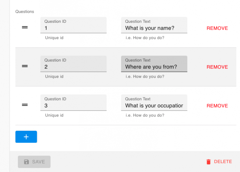
Save the file after adding the new input structure. The table is now ready for the drag-n-drop feature!
Add Drag-N-Drop Feature
The react-beautiful-dnd library uses a series of React contexts and refs to create smooth user interactions.
The breakdown for adding drag-n-drop to our project is as follows;
Everything that’s part of the drag-n-drop experience needs to be inside the <DragDropContext>.
Use the <Droppable> component to provide a landing zone for the components in motion.
Wrap draggable items inside the <Draggable> component
Provide the required props and refs along the way.
To map the above directives onto our table we need to:
Wrap the <TableContainer> in the <DragDropContext>
Wrap the <TableBody> with the <Droppable> component, adding required props to <TableBody>
Wrap each <TableRow> with a <Draggable> component, adding props to the <TableRow>
Spread drag handle props onto the parent <TableCell> of our <DragHandleIcon>
The new custom iterator file should look like the code below.
...other imports import { Draggable, DragDropContext, Droppable } from 'react-beautiful-dnd'; // new const CustomIterator = ({ record }) => { return ( <FieldArray name="questions"> {(fieldProps) => { return ( <DragDropContext // new // onDragEnd={onDragEnd} > <TableContainer> <Table aria-label="questions list"> <Droppable droppableId="droppable-questions" type="QUESTION"> {/* new */} {(provided, snapshot) => ( // new <TableBody ref={provided.innerRef} // new {...provided.droppableProps} // new > {fieldProps.fields.map((question, index) => { return ( <Draggable key={String(fieldProps.fields.value[index].id)} draggableId={String(fieldProps.fields.value[index].id)} index={index}> {/* new */} {(provided, snapshot) => ( // new <TableRow hover tabIndex={-1} key={index} ref={provided.innerRef} // new {...provided.draggableProps} // new > <TableCell {...provided.dragHandleProps} // new > <DragHandleIcon /> </TableCell> <TableCell align="left"> <NumberInput helperText="Unique id" label="Question ID" source={`questions[${index}].id`} /> </TableCell> <TableCell align="left"> <TextInput helperText="i.e. How do you do?" label="Question Text" source={`questions[${index}].text`} /> </TableCell> <TableCell align="right"> <Button style={{ color: 'red' }} type="button" onClick={() => fieldProps.fields.remove(index)}> Remove </Button> </TableCell> </TableRow> )} </Draggable> // new ) })} {provided.placeholder} {/* new */} </TableBody> // new )} </Droppable> {/* new */} </Table> <Button type="button" onClick={() => fieldProps.fields.push({ id: '', question: '' })} color="secondary" variant="contained" style={{ marginTop: '16px' }} > <Add /> </Button> </TableContainer> </DragDropContext> // new ) }} </FieldArray> ) ...
Again, save the file and test out the drag-n-drop animations!
The animations and drag handle work exactly as we want. Unfortunately, the changes do not persist. In the next step, we add an onDragEnd function and React Admin mutation query.
Persisting Changes
OnDragEnd
The <DragDropContext> exposes several callbacks that execute at different points in the interaction. The one that we focus on in this tutorial is onDragEnd. After a user drops the row into the location, we need to save the new order by sending a mutate API call to our data provider.
First, above the main return statement in <CustomIterator> define the onDragEnd function.
const CustomIterator = ({ record }) => { const onDragEnd = (result, provided) => { const { source, destination } = result; console.log("Item at index " + source.index + " is now at index " + destination.index) // Get the item const item = record.questions[source.index]; // Remove item from array const newArray = record.questions.filter((el, index) => index !== source.index); // Insert item at destination newArray.splice(destination.index, 0, item) // Call mutation function // reorder(newArray) } return ( ... <DragDropContext onDragEnd={onDragEnd} // modified > ...
The callback function receives two arguments. The first, result, is an object providing source and destination information from the drop event. Save the file and move a few of the rows around. Then, check the developer console to see how the indices give us information on ordering the new array.
Reorder
Currently, the reorder function is commented out. The function comes from React Admin’s useMutation hook. Add useMutation, and the useNotify hook, to the function.
import { TextInput, NumberInput, useNotify, useMutation } from 'react-admin'; // modified ... const CustomIterator = ({ record }) => { const notify = useNotify(); const [mutate, { loading }] = useMutation({}, { onSuccess: () => { notify('Questions reordered', 'info', {}, true); }, onFailure: (error) => notify(`Error: ${error.message}`, 'warning'), }); ...
Next, we use the mutate function, returned from useMutation, to pass in a payload for the data provider dynamically.
... const CustomIterator = ({ record }) => { const notify = useNotify(); const [mutate, { loading }] = useMutation({}, { ... }); const reorder = (newQuestions) => mutate({ type: 'update', resource: 'forms', payload: { id: record.id, data: { questions: newQuestions } } }); const onDragEnd = (result, provided) => { ...
The function is now named reorder. After defining the reorder function, you can uncomment the call to reorder() in onDragEnd.
Save the file. The data now persists through each drag-n-drop!
Unfortunately, it’s not perfect yet.
The drag-n-drop animation ends, but React Admin renders the old list before updating the table with the new data.
We can’t undo the reorder in the notification pop-up.
Final Touch
Thankfully, this is an easy fix because React Admin exposes a property on the configuration object that we pass into the useMutation function.
The property (mutationMode) modifies React Admin’s default optimistic rendering behavior.
To resolve both bugs, add the property to the configuration object and set the value to ‘undoable’.
... const CustomIterator = ({ record }) => { const notify = useNotify(); const [mutate, { loading }] = useMutation({}, { // https://marmelab.com/react-admin/Actions.html#optimistic-rendering-and-undo mutationMode: 'undoable', // new onSuccess: () => { notify('Questions reordered', 'info', {}, true); }, onFailure: (error) => notify(`Error: ${error.message}`, 'warning'), }); ...
For the final time in this tutorial, save the file and reorder the questions list.
Beautiful!
Conclusion
Using a couple of free libraries, we quickly enhanced the look and features of our React Admin project!
However, the drag-n-drop may be too good. To clarify, the feature automatically saves the modified entity, but the add and remove buttons do not behave in the same way. To improve on this form and not confuse the user, the add and remove buttons should automatically save the modified entity, providing an undo button to reverse the action.
Despite this discrepancy, we can be proud of what we were able to accomplish! Thanks for reading and following along!