Introduction
This article will examine how you can extend React Admin by adding a column export configuration form for data grids. Let’s first understand why it may be important to configure columns in React admin.
This feature is beneficial because data grids often have many columns. Although all the column data may be helpful, specific categories may only be relevant depending on who is viewing the table. Consequently, it would benefit the user to select only the necessary columns for their analysis.
The tutorial starts with setting up a basic React Admin project. Then, we’ll review the default export behavior of React Admin before implementing a pop-modal with checkboxes for the columns.
This article is a continuation of the tutorial series on how to extend React Admin. If you need to catch up on React Admin, you can read the introductory article or explore React Admin’s documentation page.
Prerequisites
There are a couple of prerequisites that this tutorial requires:
Understanding of how ReactJS works
Basic networking jargon (i.e., request, API call, fetch)
How to open and use the command line on your OS
Code editor (i.e., VSCode, Sublime Text, Atom, Vim)
I am using VSCode on a macOS system.
Download Starting Repository
You can view the completed repository at any time on Github.
The starting project for this tutorial is where the last tutorial—about adding vertical tabs—ended. Therefore, this project already includes the code on adding vertical tabs and implementing drag-n-drop rows.
We’re going to clone the starting repository from Github. To download the project, open up a new terminal (command-line) and navigate to where you want to place the repository.
Then, execute the following command to clone the repo.
git clone https://github.com/jdretz/complete-ra-vertical-tabs.git react-admin-export-column-config
Next, change directories into the project and install the dependencies.
cd react-admin-export-column-config yarn install
Before starting the project, we need to make two changes.
First, change the title in src/Dashboard.js to “How to Configure Export Columns in React-Admin.”
... <CardHeader title="How to Configure Export Columns in React Admin" /> ...
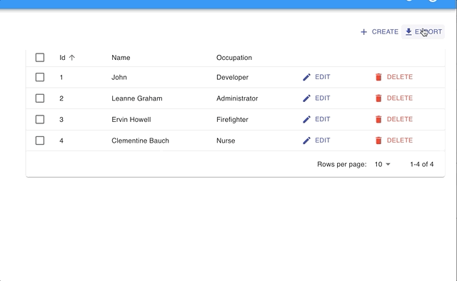
Second, add more users to the mock database object. Open mocks/handlers.js, and then add these three objects underneath the user object with the name ‘John.’
... { id: 2, name: "Leanne Graham", address: { streetAddress: "Kulas Light", apt: "Apt. 556", city: "Gwenborough", state: "", zipcode: "92998-3874", }, occupation: "Administrator", hobbies: [ { id: 4, hobby: "dog walking" } ] }, { id: 3, name: "Ervin Howell", address: { streetAddress: "Victor Plains", apt: "Suite 879", city: "Wisokyburgh", state: "", zipcode: "90566-7771", }, occupation: "Firefighter", hobbies: [ { id: 6, hobby: "reading" } ] }, { id: 4, name: "Clementine Bauch", address: { streetAddress: "Douglas Extension", apt: "Suite 847", city: "McKenziehaven", state: "", zipcode: "59590-4157" }, occupation: "Nurse", hobbies: [ { id: 8, hobby: "biking" } ] }, ...
The list now has four users in it. So, finally, we can start the project and begin.
In your terminal, at the project root, run the command yarn start.
Project Overview
This project includes the drag-n-drop row components from a previous article. Furthermore, it uses the same fake data provider and a “users” resource.
The app retrieves the data from your browser’s local storage with the help of a mock service worker. The service worker has a series of handlers (at src/mocks/handlers.js) that intercepts requests from the custom data provider (in src/dataProvider.js).
Therefore, if you ever need to reset the data during this tutorial, you can go into your browser’s developer tools, navigate to local storage, and delete the “forms” or “users” items.
Using a mock service worker as a data provider is not something that you should do in production. However, it’s convenient for the tutorial.
We’ll spend our time customizing the “users” resource in the src/users.js.
Configure Columns in React Admin by building Export Configuration Form
React Admin’s documentation details how developers can customize the export behavior for data grids. However, omitting columns in the export file relies on the developer to know the columns to bypass beforehand. Therefore, the process is static.
This tutorial takes a different approach, allowing the user to decide, at runtime, which columns to include in the export. To understand how the custom function works, let’s start with React Admin’s default export behavior and work up.
Recreating the Exporter Function
React Admin’s repository is available on Github. So, we can locate the default exporter function and examine the code (it’s written in Typescript).
import jsonExport from 'jsonexport/dist'; import downloadCSV from './downloadCSV'; import { Exporter } from '../types'; const defaultExporter: Exporter = (data, _, __, resource) => jsonExport(data, (err, csv) => downloadCSV(csv, resource)); export default defaultExporter;
When comparing the code above to the example custom export function in the documentation, you’ll notice they’re pretty similar. Below is the example custom export function from the documentation.
import { List, downloadCSV } from 'react-admin'; import jsonExport from 'jsonexport/dist'; const exporter = posts => { const postsForExport = posts.map(post => { const { backlinks, author, ...postForExport } = post; // omit backlinks and author postForExport.author_name = post.author.name; // add a field return postForExport; }); jsonExport(postsForExport, { headers: ['id', 'title', 'author_name', 'body'] // order fields in the export }, (err, csv) => { downloadCSV(csv, 'posts'); // download as 'posts.csv` file }); };
By removing the example modifications, we can essentially recreate the behavior of the defaultExporter.
const customExporter = (users) => { jsonExport(users, (err, csv) => { downloadCSV(csv, 'users'); // download as 'users.csv` file }); }
However, recreating removes the arguments that React Admin passes into the exporter function:
fetchRelatedFields
dataProvider
resource
These are useful functions and resources, but there are other ways to get them if we truly need them. For this tutorial, we do not use them.
Overriding the exporter feature
Consequently, we can disable the default button by passing false to the <UserList> component as a consequence of creating our export function.
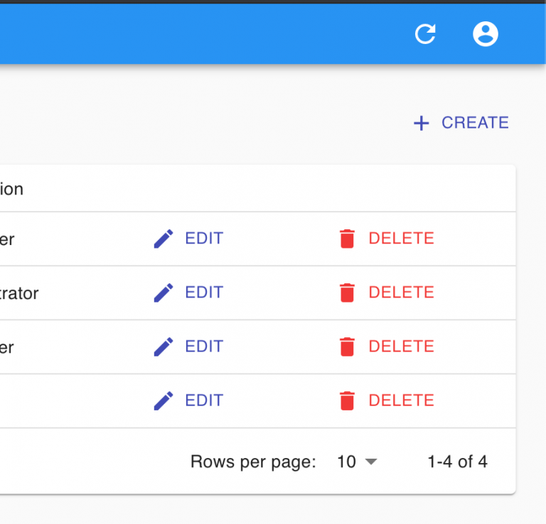
Inside of the src/users.js, pass false to the <UserList> component and observe that the Export button disappears from the view.
... export const UsersList = (props) => ( <List {...props} exporter={false}> <Datagrid rowClick="edit"> ...
Add Custom Actions Toolbar
Next, we need to add a custom actions toolbar with Create and Export buttons. Adding a custom toolbar gives us access to the Export button, subsequently allowing us to build a pop-up dialog and craft an onClick function.
Let’s start with a basic actions toolbar and then pass it to the <UserList> component. In the toolbar, we implement a:
<CreateButton>
An export button
A pop-up dialog for the export input
First, create the <ListActions> component in users.js.
... const ListActions = ({ data: users, resource }) => { const [open, setOpen] = React.useState(false); // Controls export config modal const handleClickOpen = () => { setOpen(true); }; const handleClose = () => { setOpen(false); }; return ( <TopToolbar> <Dialog open={open} onClose={handleClose} aria-labelledby="export-config" aria-describedby="export-config-description" > <DialogTitle id="export-config"> {"Choose the Columns You Wish To Export"} </DialogTitle> <DialogContent> <DialogContentText id="export-config-description"> You may choose columns to export by selecting the checkbox next to the column name. Also, you have the option to name the export. </DialogContentText> </DialogContent> <DialogActions> <Button onClick={handleClose} color="default"> Cancel </Button> <Button onClick={handleClose} color="primary" autoFocus> Export </Button> </DialogActions> </Dialog> <CreateButton /> <Button variant="text" size="small" color="primary" onClick={handleClickOpen} > <GetApp style={{ paddingRight: "3px" }} fontSize="small" /> Export </Button> </TopToolbar> ); }; …
Second, we need to import the Material-UI components in use and a couple of new components. At the top of the file, add these imports:
// users.js import // new imports CreateButton, TopToolbar, } from 'react-admin'; // new imports import Button from "@material-ui/core/Button"; import GetApp from "@material-ui/icons/GetApp"; import Dialog from "@material-ui/core/Dialog"; import DialogActions from "@material-ui/core/DialogActions"; import DialogContent from "@material-ui/core/DialogContent"; import DialogContentText from "@material-ui/core/DialogContentText"; import DialogTitle from "@material-ui/core/DialogTitle"; ...
Finally, pass the <ListActions> component as the actions prop value to <UserList>. Additionally, spread the parent props into the new component.
... export const UsersList = props => ( <List {...props} actions={<ListActions {...props} />} exporter={false}> <Datagrid rowClick="edit"> ...
An Export button should be visible. Upon clicking the button, a dialog will appear. Unfortunately, we have not set up the export function yet, so the dialog only closes when we click an action button.
Selecting Columns
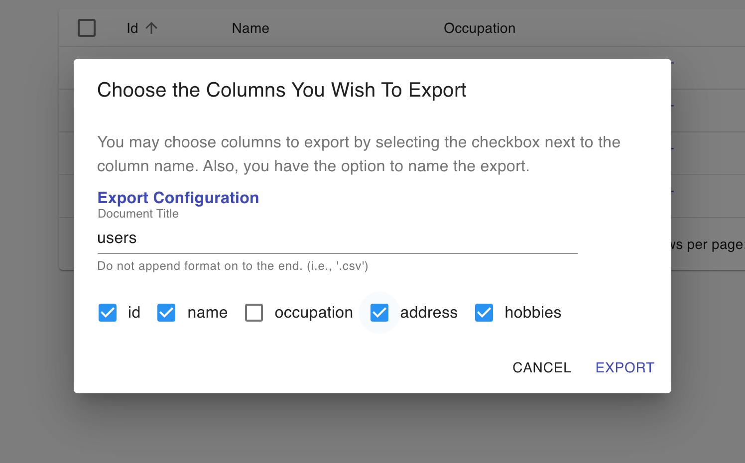
We present the list of column names to the user in the dialog in checkboxes for the dynamic export. By default, all columns are selected. However, the user will have the chance to deselect the columns before exporting to CSV.
Let’s add the checkboxes, with accompanying state controls, to the <DialogContent> section of the pop-up. Also, give the user the option of entering a custom string for the export file name.
... <DialogContent> <DialogContentText id="export-config-description"> You may choose columns to export by selecting the checkbox next to the column name. Also, you have the option to name the export. </DialogContentText> {exportColumns && ( <FormControl component="fieldset"> <FormLabel component="legend"> <b>Export Configuration</b> </FormLabel> <MuiTextField label="Document Title" id="documentTitle" value={documentTitle} style={{ paddingBottom: "16px" }} onChange={(e) => setDocumentTitle(e.target.value)} helperText="Do not append format on to the end. (i.e., '.csv')" /> <MuiFormGroup> {Object.keys(exportColumns).map((col) => { return ( <FormControlLabel control={ <Checkbox checked={exportColumns[col]} onChange={handleCheckboxChange} name={col} /> } label={col} /> ); })} </MuiFormGroup> </FormControl> )} </DialogContent> ...
Next, update the components state (<ListActions />) with the following variables:
... const ListActions = ({ data: users, resource }) => { const usersArray = Object.values(users); // Create list of user objects const [open, setOpen] = React.useState(false); // Controls export config modal const [exportColumns, setExportColumns] = React.useState(""); // User selected columns const [allColumnsArray, setAllColumnsArray] = React.useState(""); // All columns reference const [documentTitle, setDocumentTitle] = React.useState(resource); // Custom file name ...
Now, we can borrow code from Material UI’s documentation for the handleCheckboxChange function inside the component.
... const handleCheckboxChange = (event) => { setExportColumns({ ...exportColumns, [event.target.name]: event.target.checked, }); }; ...
To handle the checkbox state, we prefer to represent the column names as an object, with the columns that the user wants to use given the value of true.
Unfortunately, it’s easier—in some cases—to work with an array of column names. Consequently, we spend some time converting the column names into objects and back into lists. Update the handleClickOpen function with this code.
... const handleClickOpen = () => { const columnNames = Object.keys(usersArray[0]); // Extract user object properties /** * Create an object with column names as properties * Set all property values (for column names) to true * * { * id: true, * name: true, * occupation: true * } */ const checkedColumnsNamesObject = columnNames.reduce( (o, key) => ({ ...o, [key]: true }), {} ); setExportColumns(checkedColumnsNamesObject); setAllColumnsArray(columnNames); setOpen(true); }; ...
Lastly, we have a few new imports to take care of at the top of the file.
// other imports import Checkbox from "@material-ui/core/Checkbox"; import FormGroup from "@material-ui/core/FormGroup"; import FormControlLabel from "@material-ui/core/FormControlLabel"; import FormLabel from "@material-ui/core/FormLabel"; import FormControl from "@material-ui/core/FormControl"; import MuiTextField from "@material-ui/core/TextField"; const MuiFormGroup = withStyles({ root: { flexDirection: "row", }, })(FormGroup); ...
Save the file, and observe that we can now select column names as checkbox inputs.\
Custom Exporter Function
The component works just as we want it to in the current state, except it doesn’t export anything! So, as the tutorial’s final step, we’ll add the custom export function as the onClick handler for the Export button in the pop-up.
In users.js, add the customExporter function above the <ListActions> component.
... /** * * @param {array} users List of entity objects * @param {array} exportColumns List of strings for column names user wants to include * @param {array} allColumnsArray List of all column names for object * @param {*} documentTitle Name of export file */ const customExporter = ( users, exportColumns, allColumnsArray, documentTitle ) => { /** * Create a list of the columns the user DID NOT want to include */ const omittedColumns = allColumnsArray.filter( (col) => !exportColumns.includes(col) ); /** * Map over the user array and omit the excluded properties */ const usersForExport = users.map((user) => { const newUserExport = omit(user, omittedColumns); return newUserExport; }); /** * Use React Admins exporting functions but pass in custom data */ jsonExport(usersForExport, (err, csv) => { downloadCSV(csv, documentTitle); }); }; ...
Add the new function below to <ListActions /> and name it handleExport. Don’t forget to change the onClick handler for the Export button to the new function name.
... const handleExport = () => { /** * Convert the checkbox state object back into an array of strings * i.e., ['id', 'name'] */ const exportColumnsArray = allColumnsArray.filter( (col) => exportColumns[col] ); /** * After user is done figuring, call the custom export function */ customExporter( usersArray, exportColumnsArray, allColumnsArray, documentTitle ); setOpen(false); }; ...
And:
... <Button onClick={handleExport} color="primary" autoFocus> Export </Button> ...
Finally, import the three new items that we introduced in this section.
import { ... // new imports downloadCSV, ... } from "react-admin"; import jsonExport from "jsonexport/dist"; ... // new imports ... import { omit } from "lodash";
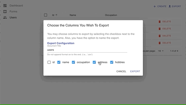
After saving the file, try only exporting a couple of columns for the CSV (i.e., name & occupation).
Conclusion
We didn’t pass in a custom document name for the export. Allowing the user to name files would require sanitation to remove slashes or other unwanted characters.
Additionally, our simple entity didn’t require the component to fetch related articles. More code is needed to fetch related documents. On the other hand, we could see improvements if we can conditionally fetch that data. For example, there may be an expensive network call for fetching a related field. However, we would not need to make that network request if the user unselects those columns.
It has been fun to explore React Admin and look at simple ways to make the software better for users and developers. I hope you enjoyed this article and hope you try it out yourself!